
A response to Kirsch's "response"
Defending your nothing-burger with a new pile of nothingness and ridiculous bets... will not help you on data matters.

I’ll proceed by short extracts to address accurately the new batch of desperate Kirschian non-sense - which he perceived as an acceptable response to the two latest articles1 2 published - the second with
.Executive summary
[…. pathos and outrage …]
I’m going to start with the “analysis” just published by OPENVAET and another he co-authored with DR AH KAHN SYED. I’ll add to the list as more are published.
A few small details, as one usually tries to go past the first paragraph, before to state something inaccurate, when writing an attempt of rebuttal.
The first “‘analysis’ just published”, mentioned by Steve, was published on December 6, 2023. Otherwise said 21 days ago, a week after the original “MOAR” - or Mother of No Reveals - video.
I took care of quoting a Steve post at this time (likely triggering an email from Substack to himself - unless he doesn’t care who quotes him), and tagged him on Twitter, offering him to debate shall he have wished to3.
He ignored that, as he does so often.
“Too many people are falling for the New Zealand Data trap. There are no alert signal (sic) in the New Zealand mortality trends and the data released is unusable.”
“Alterations made to the data by Kirsch are forbidding serious re-analysis”
“The data made public has been “obfuscated”. In layman terms, this means it has become impossible to verify, and useless for any form of real analysis”
For all 8 ten year age groups listed in the article, 20 and older, as well as for all age groups combined, the per capita deaths in 2022 were higher than 2020.
“Furthermore, Kirsch is now undermining Andrew Bridgen's efforts in the United Kingdom”
The article referenced by Steve here… isn’t the right one but the second one. Never-mind. To recall my position on past statements, in the order he sustained them :
Correct.
Correct.
Correct.
2020 was at an exceptional low in NZ in 2020 with the drastic drop in respiratory diseases, deaths by car accidents, etc. Mortality varies. That’s why we use confidence intervals prior to scream “alert”. The argument is worthless and doesn’t consider population aging. I’m sorry to have to explain this. Again. But I’ll detail it further.
Correct, your sole presence within a few meters is sufficient to damage someone’s credibility, Steve. And it’s getting worse, by the day.
This article also recapitulated various others’ reserves on the “MOAR”.
And recalled the readers to Steve’s habit to distort figures, clearly illustrated by the Pfizer trial data Kirsch chose to disregard4 when writing his own “paper” on the subject - a trash analysis based on flawed based figures as we had immediately pointed out5.
For the real deaths count during the trial, which we had published with Christine Cotton before Kirsch’s article (21 BNT & 17 Placebo), see here6.
We should precise that Michel et al. from the DailyClout clarified since, in a peer reviewed paper, that it was 22 mRNA & 16 Placebo - one of the Placebos having received a dose of Moderna7.
If Kirsch can’t admit he is wrong on this one either, with every subject id at disposal, the problem is of psychiatric nature.
We will consider this point settled and the fact that Steve doesn’t retract this piece of trash of a paper tells you all you need to know on his care to communicate accurate data to his massive audience.
Why he would feel the need to distort these figures, which are already bad for the shots, or why he never addressed a single of the major points8 9 we raised on this very clinical trial frauds, is yet another open question.
Obviously Steve missed all that, as he chose not to mention any of it, qualifying the paper as follows.
Wow. This is an evidence free post. Let me respond to each point.
Surprising qualifiers for a paper which had a source to every argument.
Steve then arguments with a chart showing an apparent 2022 rise in all cause mortality. No source. No code.
I guess Chat-GPT & his developers are in Christmas holidays.
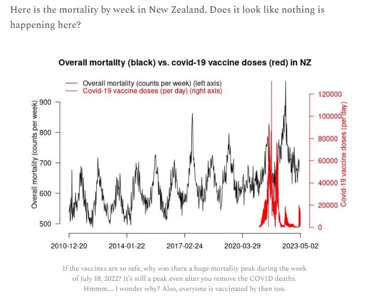
None of that appears to have any relation to the “MOAR” data… But never-mind again, I reproduced it, picking the New Zealand’s official deaths10 11 & doses injected12 13, as I certainly wouldn’t just take Steve’s word for it.
Steve’s data starts in 2010. That’s weird, because the source I have goes back only to 2011.
Removing the scale hacking (and forgetting the complete lack of normalization by age or age groups break-down)… We can generate a chart of decent width, resulting in the following.

Zooming in on the “litigious” period results in the following, which gives a better perspective on the year-long period between 2021’s shots & 2022’s deaths high rise.
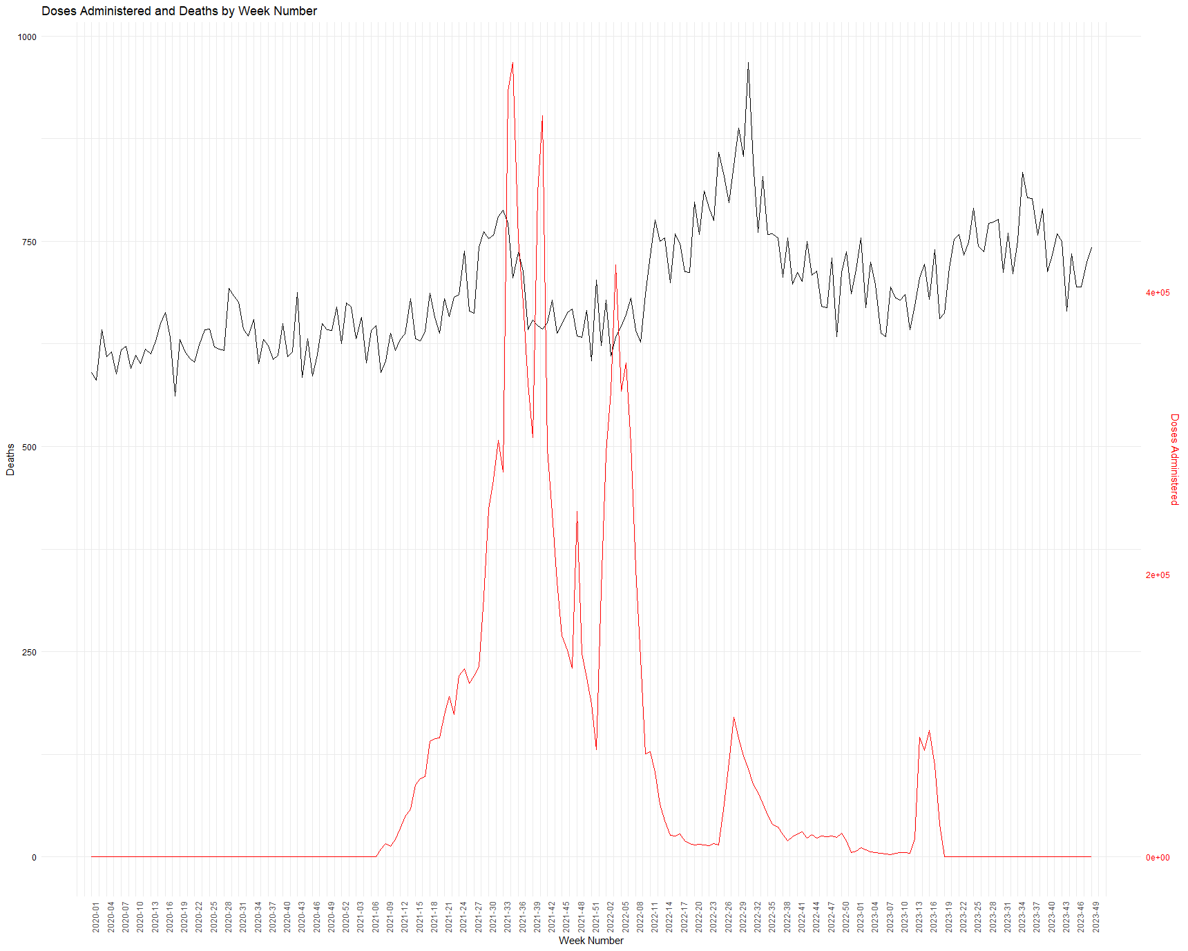
As anyone can see quite clearly on this second chart, the vaccinations occurred mostly after the spike of the 2021 deaths - and were mostly “completed” prior the 8th week of 2022. The 2022 death spike pointed by Steve starts around week 10 of 2022 (starting March 7, 2022).
So, while we know, thanks to the meticulous work of Geoff Pain, summarized in this presentation14, that the jabs (within the short term experience we currently have) will kill and maim mostly short-term due to variable-by-batches endotoxins impurities, what would be the suggested damage mechanism for deaths occurring around a year later, according to Steve ..?
Longer term potential damages of concern, such as cancers 1516, wouldn’t have had time to develop in such a short period and in such proportion.
The pattern observed would fit much closer a scenario of “not-so-deadly” lots distributed to small islands - again confirming observational data on Malta & Iceland17.
And of a totally inefficient vaccine, failing to prevent COVID-19 deaths during a 2022 winter wave - after an exceptional low in 2020 which would in any case have involved a deferral of deaths.
By chance, the NZ source we’re using also has the historic cases data18 19, which we can add to another visualization effortlessly.
It’s strange, given how easy it was to perform, that Steve didn’t judge useful to review this angle and to present it to the better judgement of his readers.
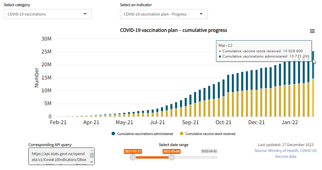
At cut-off of March 7, 2022, 2 doses of “vaccines” had been administered to 3.970.264 people - 76% of the population. The ‘vaccine’ miserably failed to protect anyone, and New-Zealand registered an all-high death wave among its most frail citizen20.

Does it require a comment ..? Or can we safely assume that even a Steve will understand the scenario [Less people dead in 2020 & 2021 + Big Sars-Cov-2 Wave in 2022 + ‘vaccine’ inefficient = A lot of elderly people dead] ?
Having destroyed the sole discernible “argument” on the first paper, let’s pass quickly on the pathetic attempts to attack the second.
Wow. Once again, they ignore the accepted definitive way to analyze the data (time series cohort analysis) and they “roll their own” analysis method and model. They cannot be questioned on this since they are the experts and they don’t have real names.
Long story short, Steve doesn’t understand the model. As we learned in our comments section, Mongol’s already had produced a similar analysis21. And since reproduced our logic independently.
Meanwhile, Steve’s Substack’s comments section looks as the following for some 11 hours, and he found nothing to reply to Dr Ah Kahn Syed - so we won’t lose too long addressing that second part.
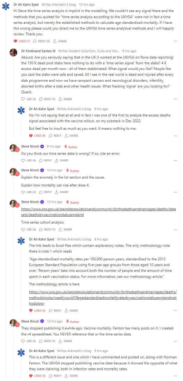
The man simply doesn’t understand the notions of aging of a cohort or of seasonality of deaths.
Dr Shiva Ayyadurai22 already told him most what I would have liked to tell him, so I will leave you with this 49 seconds of debate closure.
Steve can keep looking for excess deaths in a cohort and database under-registering deaths if it amuses him.
Given his argumentative level, his obvious limitations, and the fact that it’s likely none of substance will ever platform him again, at this stage, I will consider the matter closed - unless he agrees to my terms and retract his lies on the Pfizer/BioNTech trial.
Thanks Steve, you became the ultimate glowie detector.
Let us know when you reach New Zealand digging your argumentative hole.

Ah, I forgot to mention. People interested in genuine alert signals can look at New Zealand’s Stillbirths ; trending far above baseline since the roll-out..

Compared to a baseline 2013-2019 (mean on the z-score, linear trend for the deviation percentage) :
2021 : deviation percentage 21%, 1 sigma by z-score
2022 : deviation percentage 22%, 0.8 sigma by z-score
An observation consistent with the global collapse of the Western World’s fertility23, and the strong increase in miscarriages noted by a recent Canadian study24 among the vaccinated population.
Now can we discuss of subjects which we can substantiate, such as:
how Pfizer defrauded the endotoxins measurements to push an inefficient product25, fraudulently tested on 252 persons, to several hundred millions people?

How this product was pushed without tests26 to pregnant women thanks to fraudulent studies27?
And can we get the people - putting aside matters such as “pro” or “anti-vaccine”, to call for the transparency we need to settle the public debate?
As usual, the code is available on GitHub.
Note: I offered Steve an alternative bet. Debate on the issue, the loser retires. Let’s hope he will take it.


stats.govt.nz/experimental/covid-19-data-portal - Health - Total deaths (all causes) - Weekly deaths by age
stats.govt.nz/experimental/covid-19-data-portal - Health_COVID-19 vaccinations_COVID-19 vaccines administered – Daily total


stats.govt.nz/experimental/covid-19-data-portal - Health_COVID-19 cases_Number of cases
I've responded in my orginal article. You need to explain the figure in that section. Let's stick to the data. EXPLAIN it.
https://kirschsubstack.com/p/attempts-to-discredit-the-new-zealand
See "the third article" section. thanks.
May I ask what exactly was the egregious mistake of Kirsch's regarding Pfizer trial deaths? BTW, both of you may be interested also in looking at deaths per person year in the trials, which shows that the 21-17 ratio is more or less completely expected, as I have laid out here:
https://open.substack.com/pub/wherearethenumbers/p/anomalous-patterns-of-mortality-and
A few other points:
1. The NZ-graph you reproduced appears to have exactly the same time range. Steve's first tick mark is Dec'10.
2. Both of the reproduced vaccine rollout graphs are compatible with immediate death from the vaccines, with mortality rising slightly after vaccine rollout. I'd say the scale in your charts hides this. Also, deaths are mainly among the old, whereas vaccines are (as far as I understand) for all age groups, further muddying the waters on correlation. This point of course underlines your criticism that Steve's analysis was not stratified by age. But it doesn't disprove a connection to the vaccines, au contraire.