The New Zealand "whistleblower" data is a burger of nothing. And there is no cheese.
2023 update, and settling the debate on the "Mother of no reveals"
TLDR: We modelled the whole cohort of 2.2m vaccinated people in the New Zealand "whistleblower" data that was recently the highlight of news reports, to see if there really were any excess deaths. First an erratum on my previous article, calling out the latest attempt by Steve Kirsch to poison the well, in relative haste:
I stated that official deaths totals for 2023 weren’t available at all, and it was erroneous. The data is available in a separate EXCEL file1 on NZ’s government’s stats website, as pointed out by , joining me for this article.
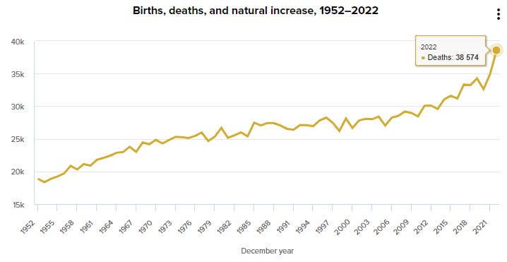
Using “official” data we can look at the excess mortality by linear trend 2013-2019, for 2023, up to September, to have a as complete view as possible on New Zealand’s (apparent lack of) excess mortality. To clarify, there was a notable bump in overall mortality in New Zealand in 2021 and 2022 - but some of this has been explained away by a somewhat unbelievable shift in the demographics of New Zealand towards an aging population. Because of this demographic shift unpicking the non-demographic excess mortality is not simple.
Because the question marks over this bizarre “whistleblower data release” were not going away, we did the exact opposite of what was suggested in the previous note above, and analysed the available New Zealand data2* itself - comparing observed and expected mortality, in order to settle the debate.
But first a review of the NZ mortality as an overall total and by age group.
Updated mortality trends
Given we only have a “truncated to September 2023” report on 2023 deaths, and that comparisons for 2022 are already done, we used a / per 10.000.000 days of exposure of the December census, from a January to September baseline comparison, for each 10-years age groups.
All Ages
By Age Groups
Under 1 year
1-9 to 80-89


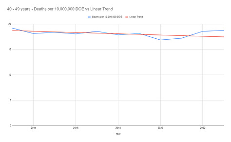


90+ years old
There isn’t much to comment in these charts. The picture hasn’t changed since the previous paper, and aside for infant deaths in 2021, there is no alert signal in New-Zealand’s global trends, with the slight increase in elderly deaths observed in 2022 disappearing. In other words, the rise in mortality in NZ appears to be explained by the increase in the elderly component of the overall population. That in itself is somewhat bizarre but not a subject for today’s analysis.
So let’s look at this controversial dataset.
The New Zealand “Whistleblower” Dataset
The purported dataset (which nobody is able to verify, of course, and could be totally synthetic for all we know) is a .CSV file of 4 193 438 records, concerning 2 215 729 subjects. We believe it was originally passed to Steve Kirsch who shared it to a data server and then it has been distributed around the world. The included data fields were:
mrn (unique identifier for the subject, but essentially just an uninterrupted integer series beginning at 0, which is never what would actually be used in a “medical record number”)
batch_id (un-usable batch reference)
dose_number
date_time_of_service (date of the dose administration - or order - that’s unclear)
date_of_death (“obfuscated”, i.e. Barnadised)
vaccine_name
date_of_birth (“obfuscated”, i.e. Barnadised)
age (of unknown accuracy)
The date range is 2021-04-08 (8th April 2021) to 2023-10-27 (27th October 2023) which is the earliest date_time_of_service to the latest date_time_of_service or date_of_death in the dataset.
After we identified a fall off in the registration of deaths in the dataset, we used a cut-off date of September 30, 2023. This is consistent with a reporting lag or failure to match deaths from whichever data source the death data came from (which was not declared to our knowledge).
There are some data anomalies as also reported by Igor Chudov
In 586 rows, the same subject doesn’t have the same date of birth than in a previous row.
In 226 rows, the same subject doesn’t have the same age than in a previous row (with variations by several decades).
In 322 535 rows, the subject age is different to the date_of_birth to datetime_of_service total years by more than 3 years. This offset falls to 97 if we use the export date (October 27, 2023), so it’s likely this variable was dynamically calculated at export time.
The highest “dose_number” for a given subject, in the dataset, is 32.
Lastly, as pointed out by Dr Shiva in this interesting presentation, 42 rows are duplicates3 in the original dataset. There are none in the dataset communicated by Kirsch - which confirms that the alterations of the ages have been very poorly done.
Given these obvious data structure and data integrity issues, which can’t be investigated much further, we assumed that the last entry for a subject was the “appropriate data” when conflicts were occurring. Bear in mind that refined analyses aren’t something we can hope to perform with this unverifiable data.
Doses administered by days in the NZ dataset
The population accrued, during the period of activity observed in the study, was the following.
The doses administered were the following.
As we can see, a lot more doses have been administered in the cold months, which were also the months where more people were dying. This answers the “but the line isn’t flat” part of the “but the time series shows deaths accruing” claim. The line isn’t supposed to be flat, because neither mortality or injections maintain a constant rate.
Death rates observed in the NZ dataset
The subjects data (we only care here about when they joined, and when and if they died) is synthesized in the following .CSV (zipped). It allows us to represent, for each month, the deaths rates observed in each group.
Deaths by days & days of exposure
As might be expected when plotting Deaths by days in all age groups there is an initial rise from the start of the dataset (as people are being recruited into the cohort). When plotted by calendar dates the deaths look like this, mostly stabilising but with a bit of a bump in winter 2023.
Normalizing by exposure-days (that is dividing by the number of people and the number of days they are in the cohort) the chart looks more like this.
This curve shows nothing but a slight increase explained by the aging of the cohort.
We modelled their data
One of the main problems we identified with the “NZ whistleblower” (NZWB) dataset was the fact that the cohort must, by nature (because vaccination was stratified by age group), be skewed to older age groups. This would then provide an artificially inflated death rate when compared to the background death rate of the NZ population. That is, it would look like the vaccinated cohort are dying more than they should, but this is just because they are an older subset.
To illustrate this here is the breakdown of the New Zealand population, with the red line overlying showing the breakdown of the NZWB cohort.
The daily probability of death has been calculated based on the concept that each New-Zealander had a probability of death corresponding to the probability of someone in their age group dying in the current month’s N number of days, between April 8, 2021 & September 2023, using the December 2021 population census as reference. Under age 1s were excluded.
In other words, for each subject available on a given day of the period observed, we considered that they had a daily death rate defined by the official mortality observed for their age group, from the day following their date of recruitment, to the date of cut-off (or their withdrawal from the cohort). This model should provide as accurate as possible a picture of the daily and overall number of deaths expected from a cohort of the specified age distribution
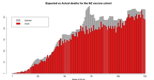
This is what the final modelled data looks like:
The red bars represent the reported deaths by week in the NZ “whistleblower” data set.
The grey bars represent the expected (modelled) deaths by week of the same size cohort with the same age distribution based on the available mortality data provided at NZstats.
The overall totals of death up to the 125th week (when the NZWB data deaths drop sharply due to reporting lag) amount to:
NZWB reported data = 36,683 deaths
Modelled (expected) data = 43,616 deaths
What you can see is that there are actually less deaths in the cohort than should be expected based on the background data - about 14% less. This is easily explained by deficiencies in recording deaths and matching them to other databases such as PPD (pay per dose). Anybody with access to the pay-per-dose data would not necessarily have access to death data, and if they did they would be relying on updated death registrations (which always lag or don’t make it to medical databases at all).
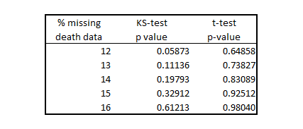
In fact, testing around a range of 12-16% missing death data rate produces a distribution of data which is statistically the same (by KS-test or t-test4.
In simple terms, the New Zealand "whistleblower" data show less deaths than should be expected for that age cohort compared to the death rate by age group for New Zealand in 2021-2023 - not more. The small reduction in deaths is almost certainly accounted for by missing death registry match ups and correcting for this shows a cohort whose death rate is no different from what the NZ death statistics tell us. Conclusion
The NZ "whistleblower" data shows nothing of consequence at all.
In fact, the data as presented show a lower death rate than should be expected based on the age distribution of the cohort. This is easily explained by a slight under-reporting of deaths (because by nature these must be collected from another data source).
So, if it doesn’t show any increase in deaths in this vaccinated cohort we have some questions:
Why do Steve Kirsch (and others) insist on touting this data set as a slam dunk for showing increased mortality?
Why did the authorities wait until it was released by Steve Kirsch at the end of November 2023, when they were aware of it at the beginning of November, if it was so illegal?
Is this data set a “false flag” to poison the well or conflate the genuine concerns over increased deaths in multiple countries following the vaccine rollout?
You decide.
We’ll just keep watching out for these shenanigans.
Whilst chomping on cheese.
The code & data used in this analysis can be accessed on GitHub.
The data set we used for this analysis was published on github and was the subject of this article. It is claimed to be the same data from the same source but with Barnadisation applied to ensure that no patient identifiable information was passed. As an additional precaution however we removed the obfuscated Date of Birth column, along with the vaccine brand, before analysis.






THANK YOU for doing this analysis. This "whistleblower" narrative pushed by Liz Gunn has divided the truther community here in New Zealand. Me being one who is appalled that Liz Gunn did this. Leads me to believe she is a ConOp. Placed early on as a journalist on our side, to get a fan base. Since she also set up her political Party supposedly under the guise of being there for the freedom fighters while taking votes off the real threat, NZ FIRST. Who luckily still managed to get in via Special votes and IS making some changes. I note how she (And Ally Cook) have specifically used this BS expose to assault Winston Peters demanding he take action using this BS narrative. When in fact NO action IS necessary when he has already announced there will be a public inquiry that will include looking into the safety and efficacy of these vaccines. The two of them made some desperate plea that its SOOO urgent and Winston didnt respond....why was it suddenly so extremely urgent when "Barry" had the data for a while. At least 8 months?!
Not forgetting, this data shows NOTHING and is pure speculation. Anyone who can google NZ death stats and compare that to this data would see that straight up. All they presented was their own TWIST on the data using the worst month they could find on deaths, for maximum impact. And even in court, the only way to prove a death is via autopsy, not speculative data.
There is excess deaths yes, there are vaccine deaths yes but this is a total SCAM. Especially since they are also inviting Kiwis to come forward as a whistleblower if you have any information. BUT, where would the support and protection be exactly when Lix Gunn herself RAN AND HID like a COWARD when Barry was arrested! Mind you, that was all part of the intentional drama and emotion for their narrative! And you look overseas to see what happens to whistleblowers, NOT wise. Leave it to Winston and the Public inquiry being done where Im sure he and his team do have experts in their fields who will provide expert and qualified evidence instead of this BS SCAM from Liz and Kirsch. I believe there has been another lady investigating actual suspicious deaths since 2021 that could be vaccine related and has been interviewing people if possible and has her own database. That would be more reliable than this bs data scam. There is also our VAERS data that is more reliable than this BS data scam that someone also recently released on substack.
Kirsch IMHO can STF away from NZ and our genuine freedom movement. Kirsch who using bully tactics harassed everyone who dared challenge is data representation with his usual 1 million dollar bets where all he would do is argue his own narrative. He also LIED about his server being taken down where he was "ghosted" by Wasabi. I got the data off his server myself on the 4 Dec and when I saw his BS follow up on this whistleblower after he was arrested, I checked his server 7 Dec and could still dload the data! I took a snapshot of me logged on!
One clear sign to pick out a Controlled Operative is whether or not they are actually making a difference OR if they are creating Chaos and Division. Liz shows herself as a truther but IS creating chaos and division. We dont need the infiltration nor division and those of us aware to whats going down with this global coup are see a Con a mile away, we aint all the "sheep" the world believes us to be.
Meanwhile...why was there a mass population 'vaccine solution' against a disease it was known from the beginning wasn't a serious threat to most people?
The political and social damage caused by the imposition of coercive/mandated vaccination must be evaluated - the destruction of personal autonomy and bodily integrity, and the exploitation of the population with highly questionable vaccine products.
The most astonishing thing is the medical 'profession' collaborated with the violation of voluntary informed consent, the most important ethical principle in medicine.
And it's still happening... I question whether anyone has given valid voluntary informed consent to the Covid jabs...or any vaccination for that matter.