
US Data: Census Flaws, Alert Signals, Births & Deaths
Why accurate Census data matters for alert signals - plus falling U.S. births and exposing Ethical Skeptic’s fraud.

TL;DR
Accurate census data matters - Errors or policy-driven adjustments can distort population denominators, impacting public health statistics, risk assessment, and “alert signals” (e.g., cancer rates per 100k).
Census inconsistencies - Large discrepancies appeared in the 2010 and 2020 counts, especially among children and teens. Smoothing corrections show a more realistic cohort aging pattern and better align population data across years.
Births declining, deaths rising - U.S. natural population growth was already falling pre-COVID due to aging and lower fertility. COVID & abhorrent measures accelerated this.
Cancer alert signals clarified - Adjusted population denominators make cancer-related mortality alerts in younger groups (10-19) more statistically robust, revealing signals that unadjusted data might hide.
Infant death “crisis” is fake & manufactured - The Ethical Skeptic’s claim (“20-sigma increase in infant deaths”) is shown to be fabricated. Actual infant death rates, while rising slightly since 2021, remain below 2018 levels.
Since 1790, the decennial census in the United States (U.S.) has been conducted every 10 years, with April 1 designated as “Census Day.”1 The original purpose of the Census, in the U.S. was political.
The U.S. Constitution authorizes Congress to conduct a census “in such manner as they shall by Law direct” (Article I, Section 2). Historically, censuses were used to levy taxes, seize property, or conscript young men into military service. For Jefferson, Madison, and the other Founders, the vision was to count every person living in the new United States and use that count to determine representation in Congress. Placing this requirement in the Constitution marked a turning point: it transformed the census from a tool of state control into a mechanism for political representation, empowering the governed to shape their government.
Between each census - which provides a population snapshot every decade - the Census Bureau produces annual population estimates. Each year’s estimate is based on a model that incorporates population change since the last census: births, deaths, legal immigration and emigration, and, by definition, an estimate of illegal immigration.
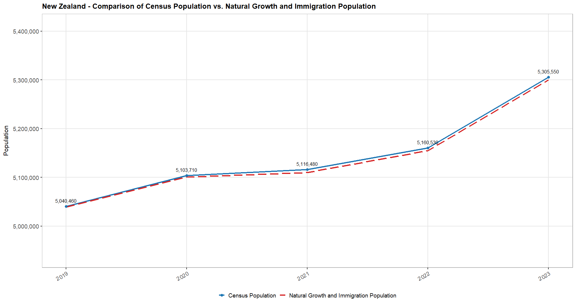
The country’s size, the complexity of its borders, its attractiveness to migrants, and the relative openness of legal migration policies all influence illegal immigration. Therefore, the margin of error in U.S. population estimates will always be greater than in a smaller country such as New Zealand2, where estimates closely match figures reconstructed from online datasets on natural growth and legal migration data.
These preliminary considerations matter to properly assess a country’s natural population growth, the relative weight of legal and illegal migration in its demographic balance, and the rise or decline of key phenomena - for example, cancer incidence rates normalized by the size of the population exposed in a given age group.
Studying U.S. Census data in this context reveals several alarming patterns.
In 20223, I came across a significant and highly unusual shift in population trends between 2020 and 2021. I also noted discrepancies amounting to several million people in reported population across important COVID-19-related datasets, such as vaccine doses administered. At the time, I did not pursue the issue further, concluding that President Biden’s Executive Order 139864 - his second action after taking office - had significantly distorted U.S. population data5, rendering it nearly unusable for my purposes.
We will return to this point later. First, let us examine the main drivers of U.S. population change over the past century: births6 7 and deaths8 9, as reflected in CDC WONDER data (R). These are easily compared from 2007 to the present (note that post-2023 data is provisional and subject to revision).
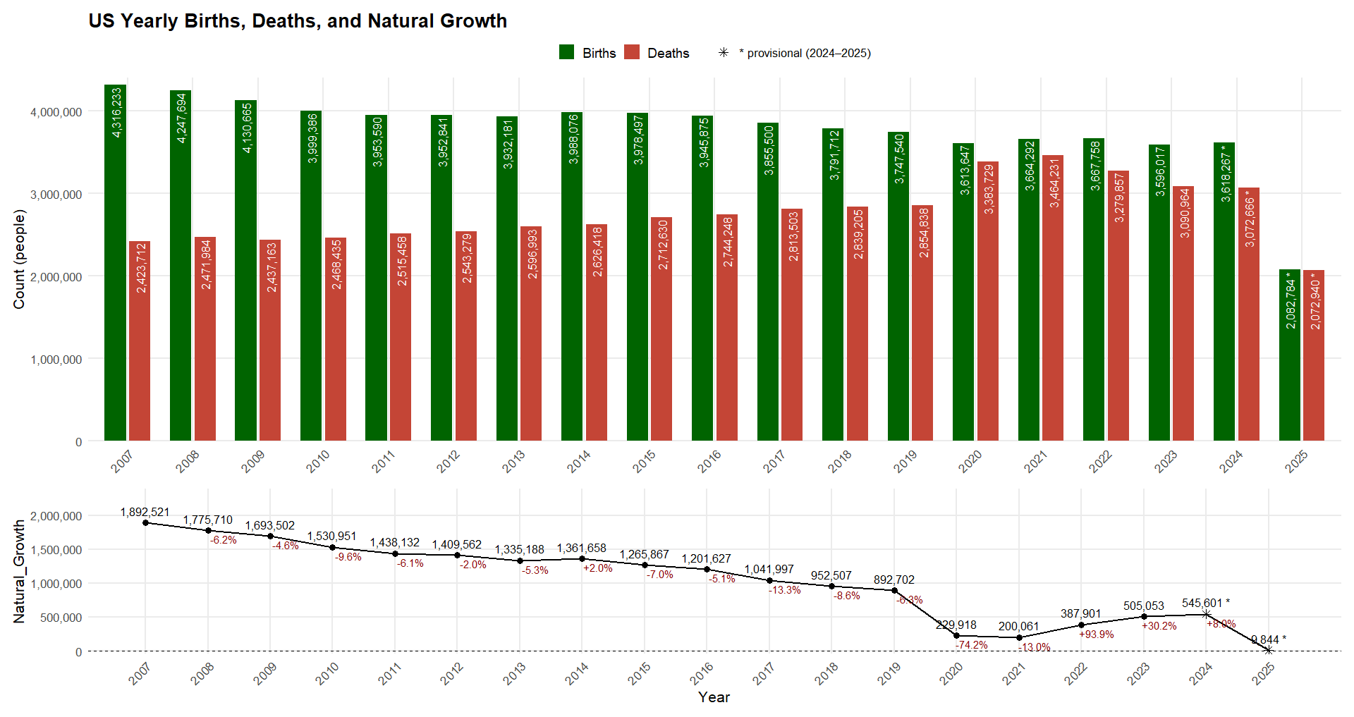
This highlights a first obvious U.S. issue: natural population growth was already in steady decline before COVID, driven by gradually rising deaths from population aging and steadily falling births. The largest year-over-year decline of the natural growth, prior to the pandemic, was -13.3% in 2017, but COVID-19 caused an even sharper drop, driven by excess mortality. Natural growth only returned close to its 2007-2019 linear trend baseline in 2023.
Preliminary data for 2025 appears concerning, but historically, births have exceeded deaths in the September-December period (with 2020 as the exception), so the final 2025 figures may still align more closely with the long-term trend.
Before normalizing birth rates by maternal age group or examining mortality patterns in greater detail, it is important to first verify the consistency of the underlying population data - particularly its breakdown by age group. This brings us back to the Census data.
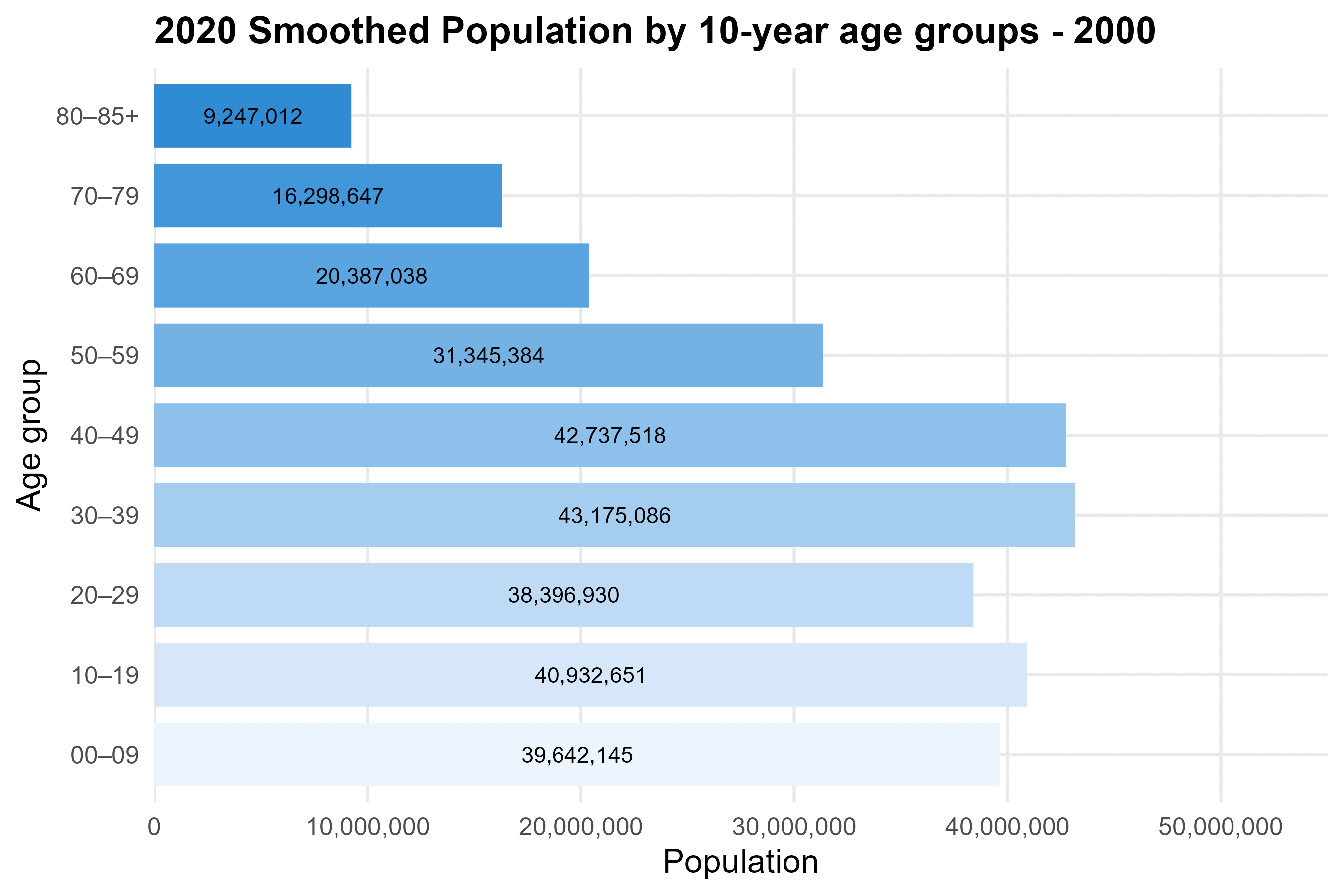
To explore this, we use a first R script to download the 2000-2009 data10. One file provides the 2010 census figures and annual estimates up to 201911, while another contains the 2020 census figures and estimates through 202412. The following animation illustrates the shift of the U.S. population pyramid toward older age groups since 2000 (R).

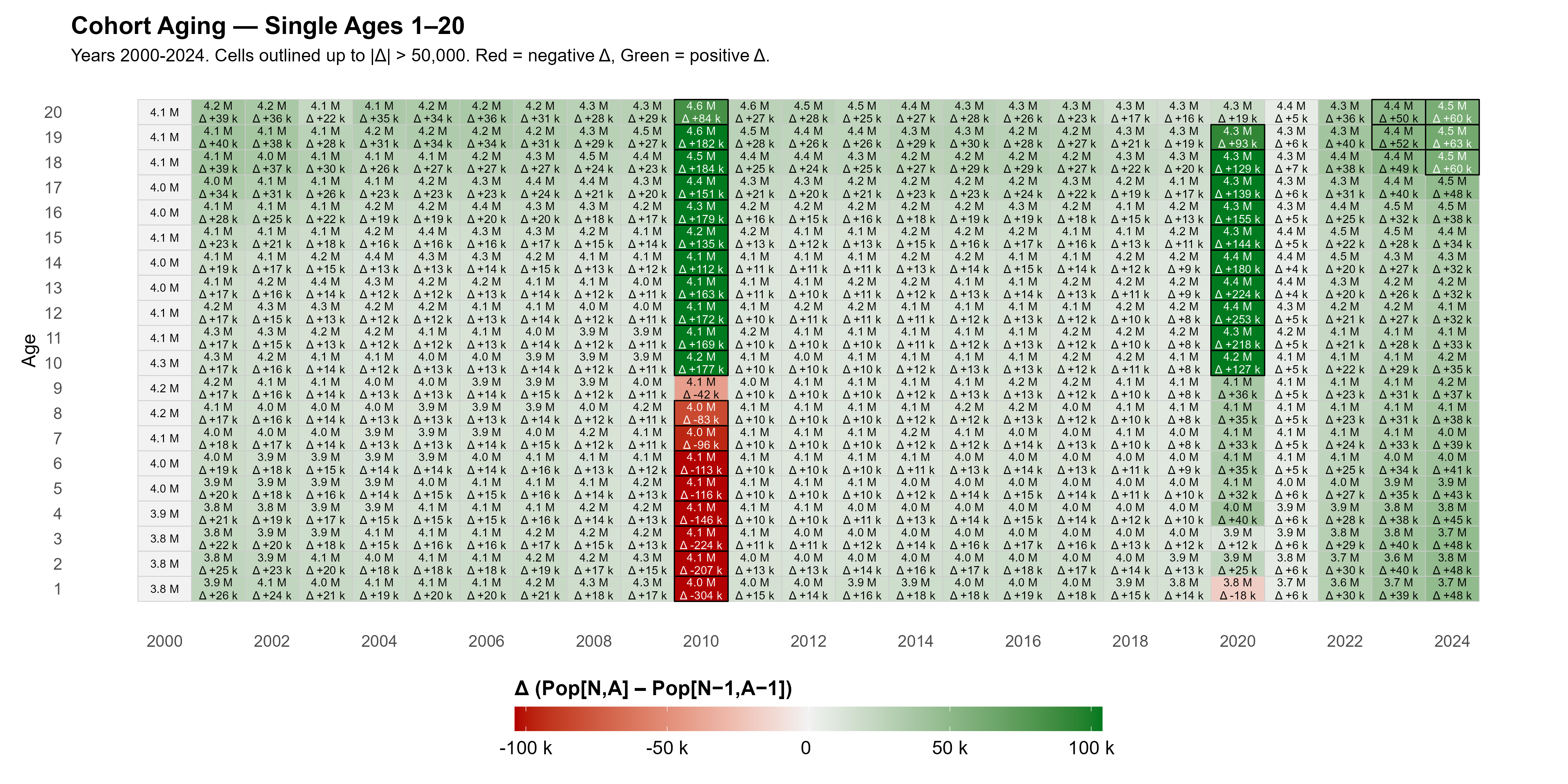
To assess whether cohorts age as expected, we compare each cohort year over year (e.g., Year 1 in 2011 vs. Year 0 in 2010). The view up to age 20 highlights offsets in the population year-to-year aging, up to 50,000 people (R, All Ages).
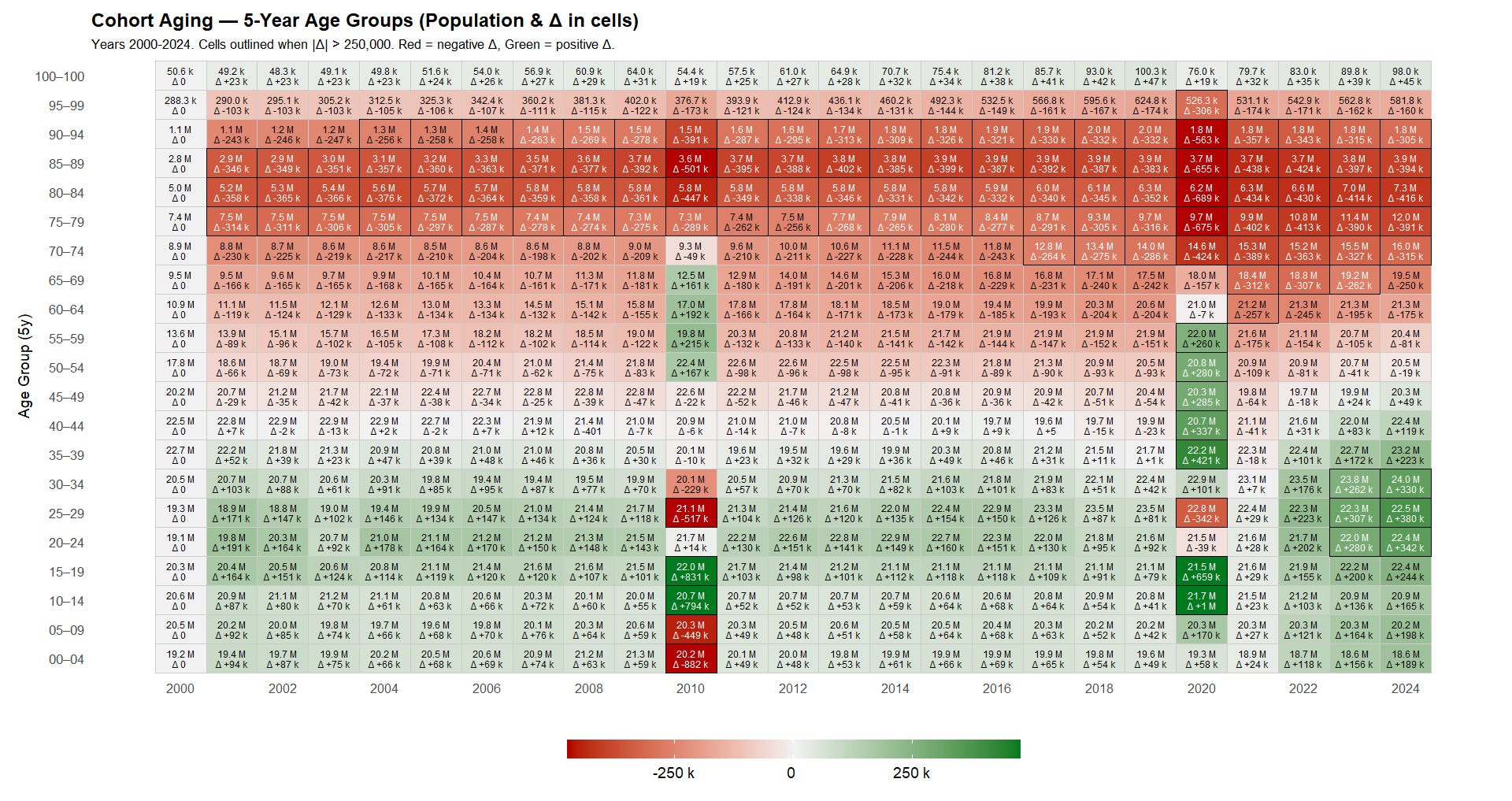
Examining the same phenomenon by more readable 5-year age groups over 2000-2025 yields a complementary picture, this time highlighting only offsets up to 250,000 or more (R).
Several observations emerge, beginning with the 2010 census:
- Ages 0-9: The 2010 census correction produced a large downward adjustment - 1,331,030 fewer children compared with the 2009 estimates. This error was the subject of a 2019 investigation, but it remains unclear how the Census Bureau ultimately resolved it, as the offset does not appear to have been fully reconciled, and that they went for a smoothing over the last years, consistent with population aging.13
- Ages 10-19: Conversely, 2010 shows a +1,624,523 adjustment for ages 10-19, reflecting an underestimation in projected teenagers for this cohort.
These issues were addressed in a revised 2010 census series, which smoothed the offsets across prior years.14 However, that series reports age only up to 85+ (rather than 100+ in other datasets). The effect of this smoothing is illustrated in the cohort-aging breakdown by age group below (R).
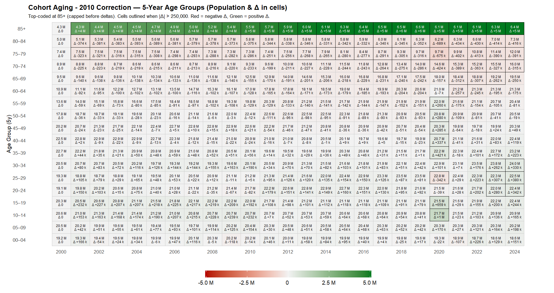
It is therefore likely that the 2011-2019 estimates will eventually be subject to a revised, “smoothed” correction to account for the +1,660,286 in ages 10-19 and the −342,286 in ages 25-29 that appear in the transition from 2019 to 2020.
In the meantime - since no such revised estimates are available from the Census Bureau - we apply our own smoothing (R), distributing the 2020 discontinuities evenly across 2011-2019. Because the census was conducted during the pandemic year and older ages are less affected by migration-driven shifts, we limit the smoothing to age 59 and under. The resulting dataset (see CSV) yields far more consistent year-over-year cohort aging relative to the 2020 census (R).
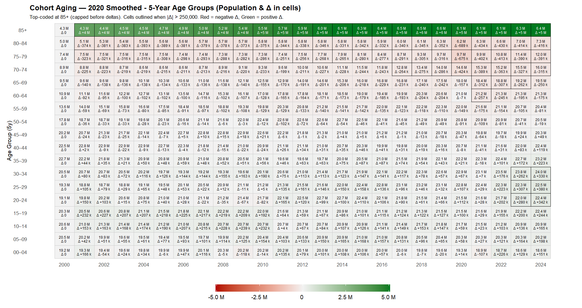
Along with the following updated animation of U.S. population aging (R).
Now that we have a usable population series, it is useful to visualize how rationalizing the census data affects rate-based alert signals.
Carlos Alegria, David M. Wiseman, and Yuri Nunes published an alert in March 2024 on neoplasm-related deaths (ICD-10 C00-D48) among ages 15-44.15 Retrieving deaths by underlying cause of death,16 17 first without adjusting the census denominators, allows us to verify this signal (R).
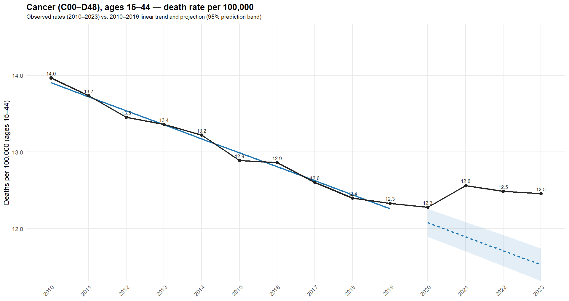
The 2020 correction effectively adds ~1 million to the age-10-14 denominator (≈5% for that cohort). Any rate-based alert (incidence per 100k, O/E ratios, etc.) may drop purely due to this denominator change - enough to push borderline, low-incidence signals back below threshold. Focusing on ages 10-19 (R), the difference is clear in the following plot (red = unadjusted; blue = adjusted).
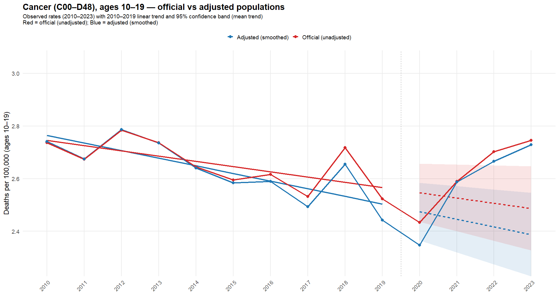
As illustrated, the unadjusted population yields a higher trend, and those values remain within - or close to - the 95% confidence interval. Which, if not exceeded, typically means no investigation is triggered. The adjusted series lowers the baseline, and 2021 to 2023 fall outside the 95% interval, clarifying the potential signal for pharmacovigilance.18
To conclude this overview of U.S. data, it is useful to look at two angles that merit further examination: births - because declining fertility is a central concern - and infant deaths - because a nudge expert has claimed a 20-sigma increase in infant deaths based on non-normalized figures.19
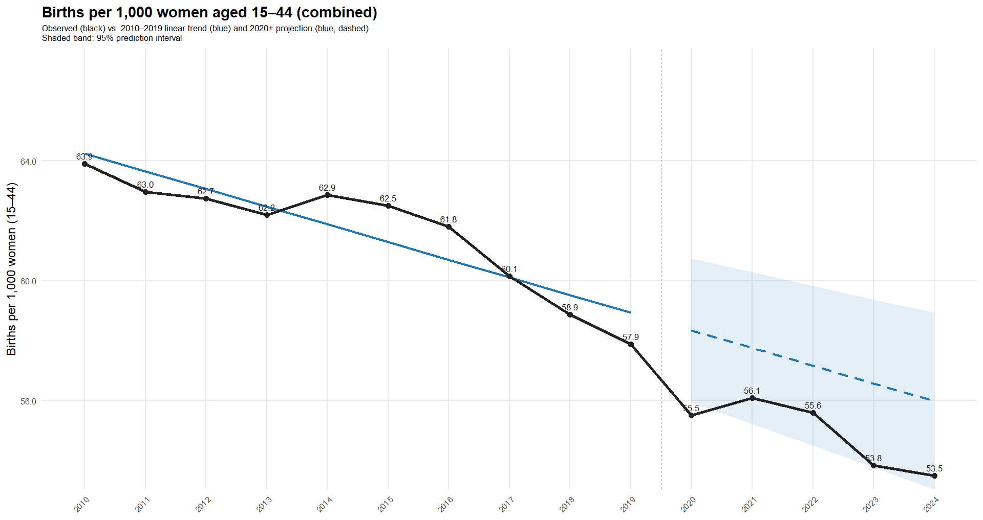
For births, we first apply the same census adjustment for females (SEX = 2)20 (R). Using births by maternal age group, and excluding “Under 15” (0.1%) and “45+” (0.2%), we obtain rates per 1,000 women in the age group. As in most Western countries, 2020 shows a sharp decline, followed by a rebound in 2021, and then another drop, driven mainly by ages 30-39 (R).
Having observed both fewer babies in raw counts and declining rates since 2021, it is reasonable to ask how a 20-sigma increase in under 4 deaths - mostly driven by infant deaths - could occur. Spoiler: it can’t happen.
The following plot shows infant death rates per 1,000 live births (R). While the rate rose in 2022 and 2023, it remained below 2018 levels.
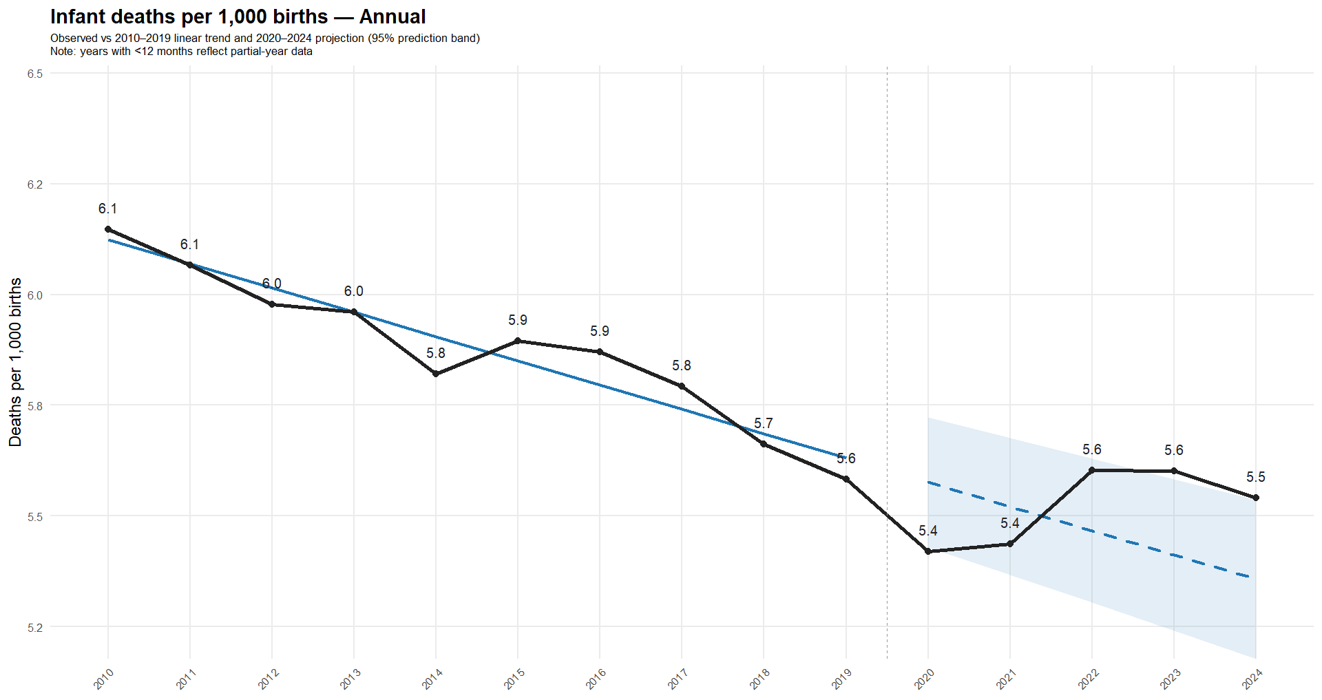
Notably, 2020 and 2021 were historically low - so much for COVID being a major danger to newborns and a justification for vaccinating mothers without robust efficacy or safety data.
To be clear, there are alert signals around U.S. infant deaths worth studying; the point here is not to claim there is no cause for targeted concern - especially in a country whose infant death rate is more than twice that of South Korea21.
If there is one point on which I agree with Henjin, it is that “The Ethical Skeptic” (TES) is a complete fraud: reproducing his “analysis” requires reverse-engineering how he manipulated the data to undermine the credibility of those whose confirmation bias he exploits.
No one has reproduced his sky-high cancer trends because he falsified the baseline by removing high-mortality months. Likewise, no one will reproduce his claimed 20-sigma increase in raw infant deaths because he falsified the data - again.
To confirm this, we independently digitized TES’s chart (R) and compared the extracted series with the CDC WONDER database, which TES claims as his source. As a validation of our reverse-engineering accuracy, the figure below shows TES’s plot for 2019-2024, with our digitized data points shown in green (see CSV).
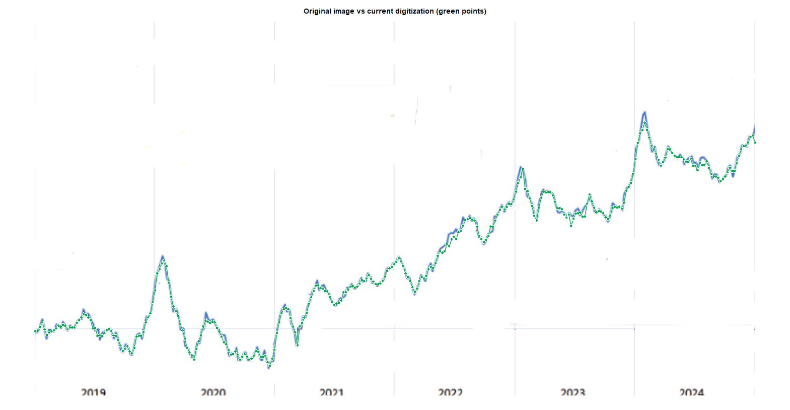
We then used another script (R) to merge the WONDER counts of non-COVID deaths in ages 0-4 with TES’s purported excess (see CSV). The next plot compares TES’s “excess” with the actual 5-week moving average of excess non-COVID deaths in ages 0-4, using a 2018-2019 baseline (R).
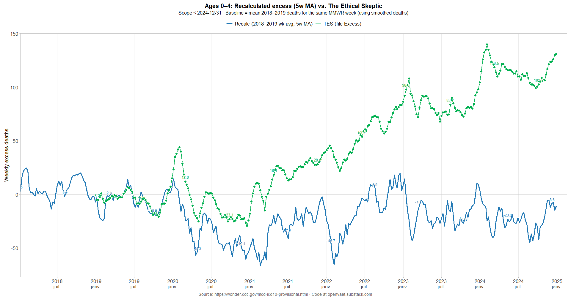
While his series tracks reality through 2019, it diverges sharply in 2020. The distortions TES applies are “straightforward” to understand:
Early 2020 (weeks 1-4): amplify increases.
When the data are above baseline (positive excess), he boosts them further (by adding or multiplying), making the increases look larger.Early 2020 (weeks 5-11): flip negatives to positives.
When the data are below baseline (negative excess), he reverses the sign so “fewer-than-expected” becomes “more-than-expected.”Early 2020 (weeks 12-13): compress declines toward zero.
He keeps the negative sign but shrinks the magnitude, making fewer-than-expected weeks appear close to no change.Rest of 2020: soften negatives; impose a floor.
After week 13, the series still follows the week-to-week shape, but negative weeks are muted and an artificial floor keeps the line from dipping.2021-2024: ratchet the series upward.
A rising baseline is added over time, so the curve keeps roughly the same “wiggles” as the real data but rides progressively higher each week.
Plus a few manual tweaks along the way.
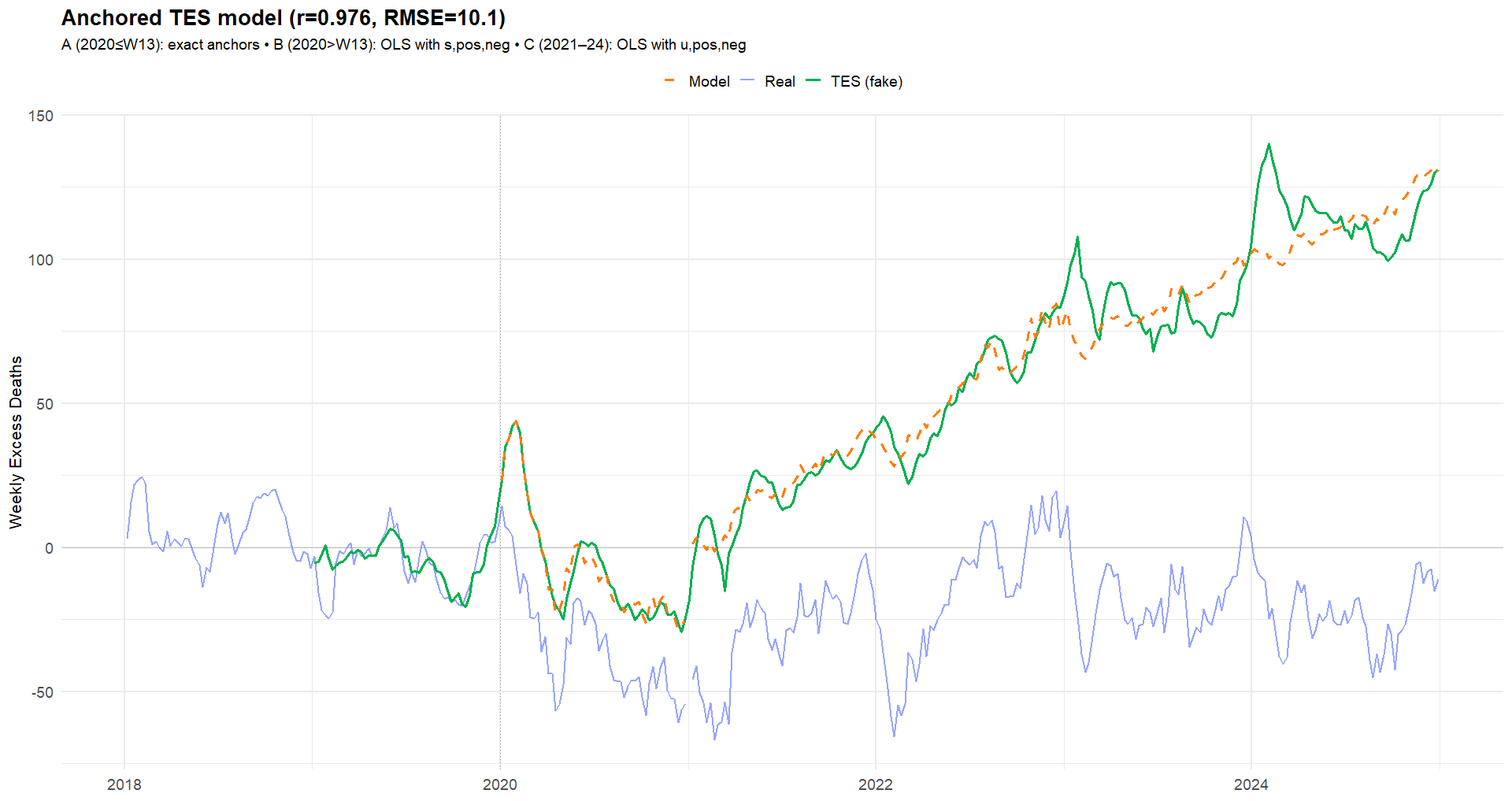
We used one script to diagnose the differences between the source data and TES’s values (R). A second script applies the same transformations to the real series to show the effect that would be obtained by such manipulations (R), completing the demonstration.
As a rule, readers should treat analyses (ethically) skeptically when authors do not share direct links to data sources and the spreadsheets or scripts used to produce their figures: without reproducibility, independent validation is impossible.

Failures to Act - The Real Peter Marks

The darkest aspect of corrupt clinical trials and the defective products that follow is the toll of injured people they leave behind.
FTR, I am with you on the major points. I may come back to this post later with some tibits about NYC and things I know are the case in my county (in Chicagoland), having spoken with the ME.
Suffice to say, US infant mortality is a beast. IMO, it's almost not worth analyzing without zooming in on the population centers.
Live birth timeseries is helpful if one can get it. Definitions are impt too, as those can differ by state and/or over time. A death certificate for an infant and a cert for a fetus are not the same in many places, AFAIK.
I am sure you already know that WONDER has the infant data broken down into days/months old
Infants should always, always be separated from age 1-4.
EDIT: one more thing - the census issues were spotted among X analysts doing "unvaxed/vaxed" data analysis in 2022. I can try to dig up my threads w/Chicago. Clayton Cobb was flagging NYC